
Sizzle Online – web design trends for 2015
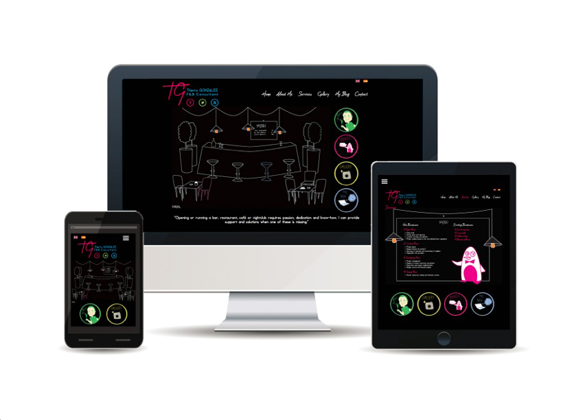
At Peppermint we pride ourselves in being one of the prime web design agencies in Marbella and on providing our clients with sparkling websites that reflect current web design trends. Whether our clients are in Spain, Gibraltar or the UK, we take great care to make sure a website stands out online and that it supports an online marketing strategy. We also supply website copy for a many of our clients’ websites: this ensures that the visual impact and the language have a coherent emotional impact.
Our design team keep a close eye on graphic design and web design trends, so as it’s almost the end of 2014, we thought we’d share what we’ve learnt so far about the web design trends that are likely to be popular in 2015.
Web Design Trends for 2015
1. Vertical scrolling
You may have noticed that vertical scrolling websites have become a mainstream trend this year. The style started back in 2010, but has only recently taken off. One of the reasons vertical or parallax scrolling is here to stay, and likely to become even more popular in 2015, is that done well it creates a great reading experience – oh, and it’s perfect for mobile devices. They’re all about scrolling, and in 2015, we’ll see more websites designed with ‘mobile’ uppermost in their mind.
2. Grabbing Graphics
It’s not just a case of every picture tells a story, but more of a case that a picture is worth a thousand words. Large images with eye-catching colours that load quickly are the future, and the image must stop at the screen break, so that the reader only sees the content below as they scroll down.
3. Responsive Design
With more people browsing your website on mobile devices from next year, you will need to make sure that your website design adapts to the mobile device. Designers will need to think more like website users. Responsive design allows a website to recognise which type of device it is being viewed on and adjust the screen view to the screen size. Clever hey!
4. Moving Backgrounds
Web page backgrounds will have moving images using HTML5. These video backdrops are embedded in the page. They’re not brand promotional videos, but images that enhance the reader experience, according to online magazine Graphic Design Junction.
We’re sure there will be plenty more design trends that will emerge throughout 2015. We’ve all come a long way from the static, brochure style website that everyone used to think was the best thing since sliced bread.
But the digital world is a fast moving one, so if you’d like a website that is really ‘on trend’ contact Jade Thompson on +34 951 316 553 or email info@peppermintcreate.com